The partners understood how to deliver better alert systems. They knew the brand should be unique, memorable, and signify protection, speed, and superior alert and response. As we prepared for the launch, one of our first tasks was to work together and find the ideal name. We agreed the name should suggest fast response, be easy to remember in an emergency, and make claims the company will always keep. Early in the process, all stake holders agreed the color blue (the emergency color) would be an integral part of the brand. After research, brainstorming, and filtering we presented the partners with seven name options. One rose to the top, BluePoint Alert Solutions. It met all of the criteria set at the beginning of the project.
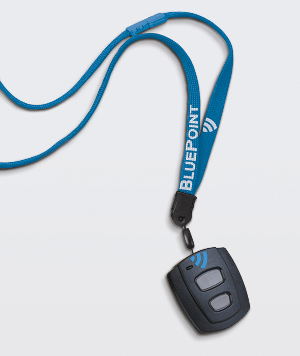
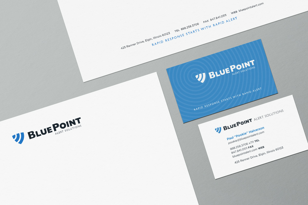
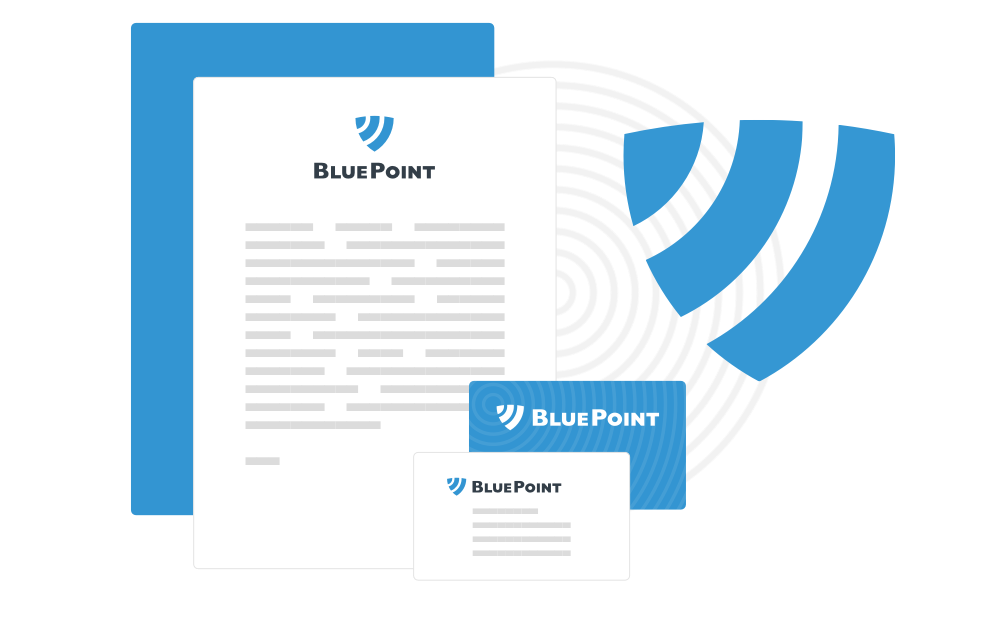
After selecting the name, we worked on designs for the logo, business card, and letterhead. Our initial ideas helped us realize that both the content and design needed to communicate three main ideas (prioritized in the following order): security, communication, and speed. We combined these three ideas in several ways. Each emphasized a different strength, allowing the partners to see what look best represented their service. As we refined the concepts, one mark rose to the top. This simple mark communicates the essence of all three messages. Communication waves are sent out from the blue point. Emergency responders rush to the blue point. Combined the waves form a shield of security. We removed all other elements from the mark. The simplicity of the forms matches the simplicity of the name. The mark gives the user an idea of what the BluePoint device accomplishes. It met all of the criteria we set at the start of the project and communicated our agreed upon priorities.
Once we completed the logo, we integrated aspects of the design into our work on the business card and letterhead. The back of the business card is covered in blue waves to underscore the importance of communication. Complimenting the brand identity, we kept both pieces clean and simple to show that Blue Point offered a clear promise and dependable service.